


The Impact of Colour on the Office Environment: Boosting Mood and Productivity

If your employees stare at white walls and walk on bland carpet all day, you’re missing a trick to boosting productivity and happiness in your workplace.
Bright and bold colours can transform your dull workspace into an energising environment that fosters creativity and enhances focus among your team members.
Join us below to discover the best colours and tactics.
Psychology and colour
Colour information rapidly processes through our brains – an evolutionary skill honed for crucial survival advantages like detecting food, threats, and environmental changes.
Cultural influences and personal experiences have further moulded these perceptions, layering them onto evolutionary foundations that subtly yet significantly influence our moods, thoughts, and behaviours.
You can use these colour associations in your office to promote a calm, productive, and happy workplace your employees enjoy being in.
Energising with red and yellow
Red stimulates energy and excitement, ideal for areas requiring high activity and quick decision-making, such as brainstorming spaces and meeting rooms.
Yellow sparks optimism and creativity for collaborative project areas and communal spaces like canteens. Introducing pops of yellow to workspaces can also bring cheerfulness and encourage out-of-the-box thinking from your employees.
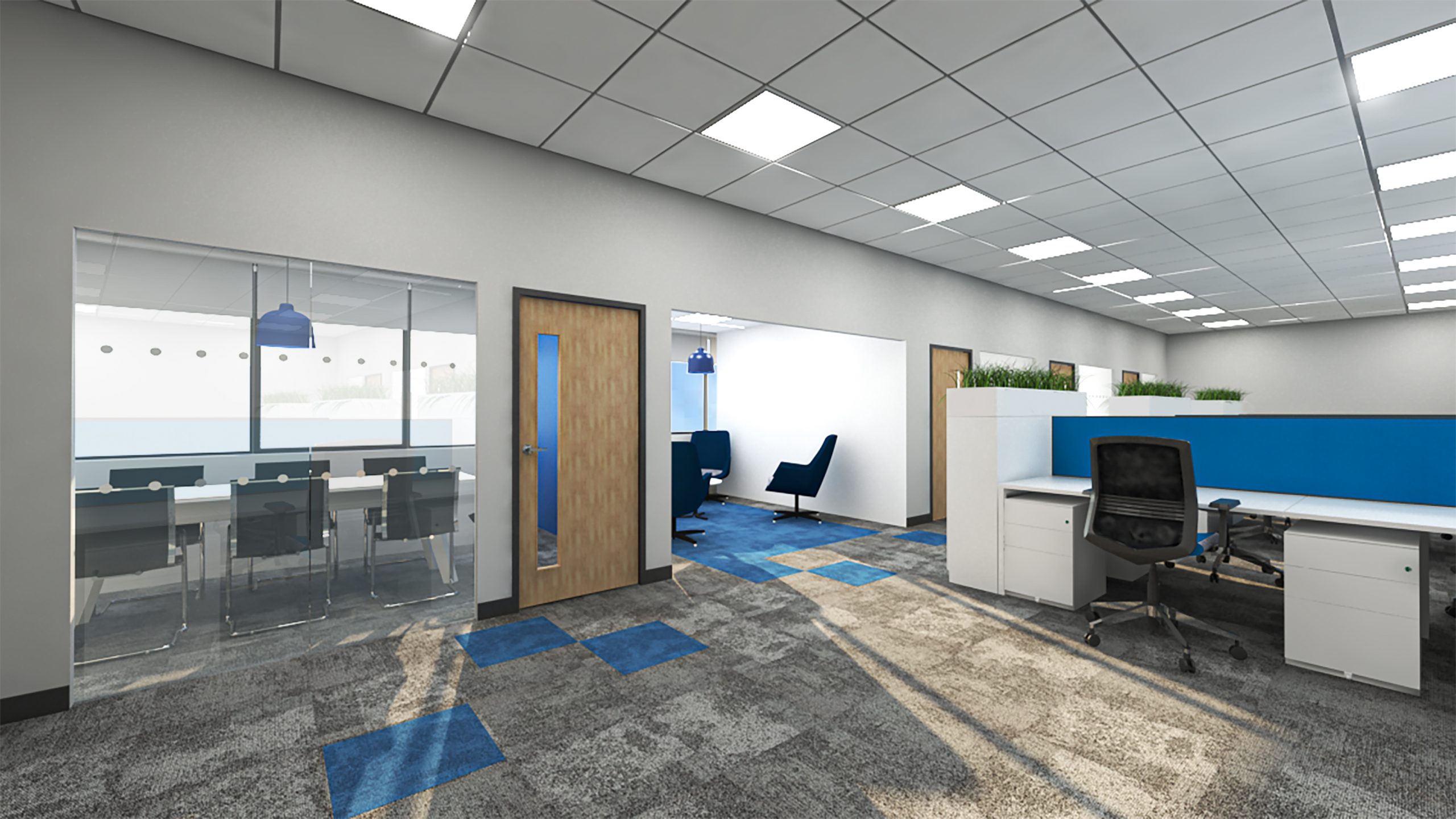
Calming influences with blue and green
Blue is a fantastic colour for office zones dedicated to detail-oriented tasks and deep thinking because it promotes concentration and focus.
Green is a stress reducer and will help bring balance to your office. Adding green elements through paint, furniture, or plants will create a refreshing atmosphere that supports employee well-being and job satisfaction.
Warmth and balance with orange and neutrals
Using orange accents in break areas or collaborative spaces could encourage communication and teamwork among your staff members.
Orange is an intense colour, so we recommend incorporating neutral tones like white, beige, or grey as a base to provide a clean canvas.
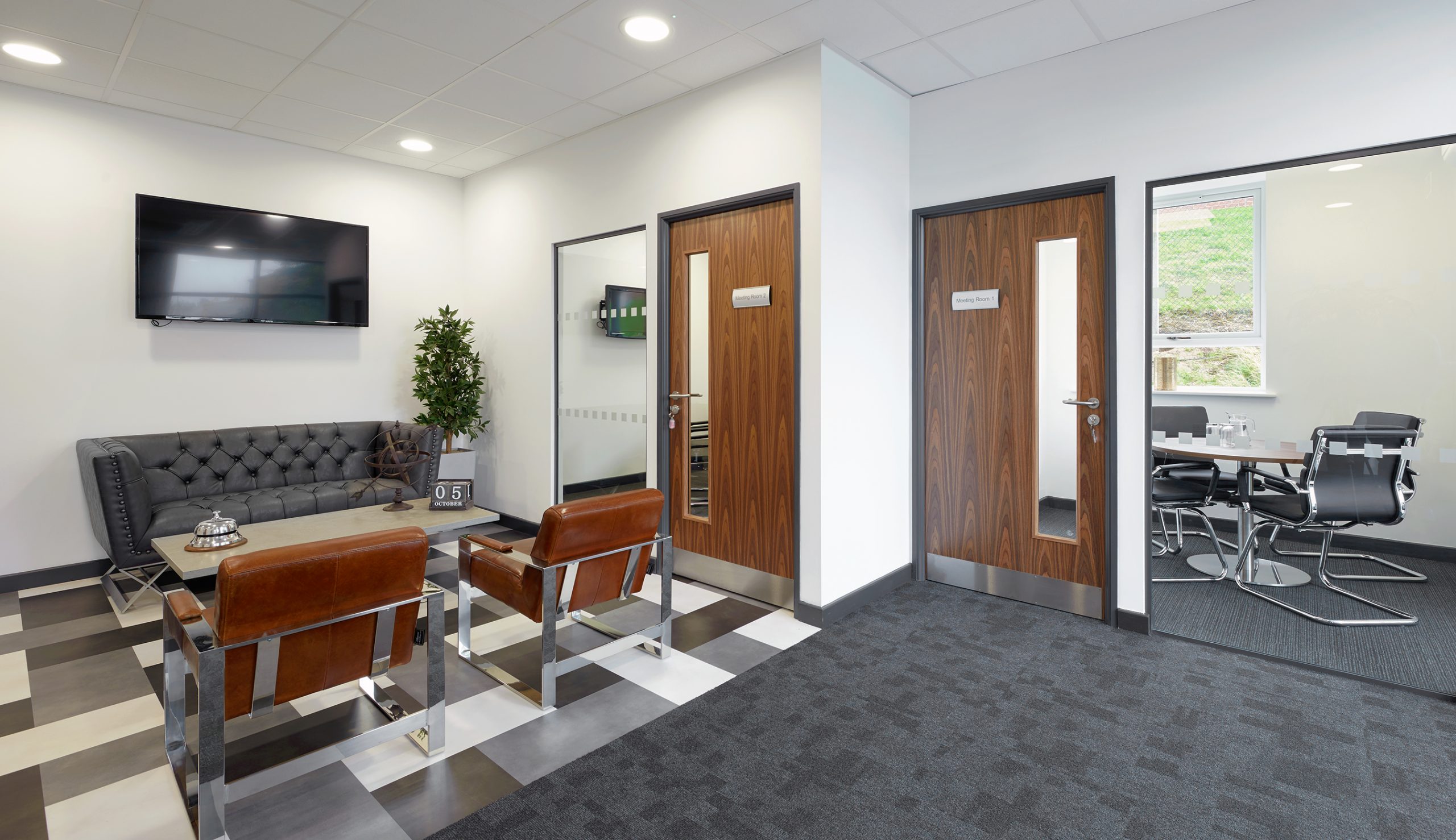
Tailoring colours to specific areas
Your meeting rooms could use calming blues and energising yellows to promote focus and creativity, while boardrooms could use muted tones.
Asking your workers what colours they like and personalising their workstations can create a sense of personal space and reduce visual distractions.
Communal areas and breakout spaces can have brighter, more vibrant colours to encourage social interaction and relaxation during breaks.
Using white space
Throwing loads of colours into your office and expecting them to work will only lead to a cluttered interior without balance.
You need white space – blank areas – to separate office areas and emphasise other design elements like artwork and feature walls.
The unoccupied areas of your office, such as around and between furniture and cubicles, are the best places for whitespace.
The role of lighting in colour perception
Natural lighting and cool-temp light bulbs enhance indoor colour vibrancy, while warm artificial lighting creates a more homely feel.
You should experiment with various lighting options to achieve desired effects and create a cohesive colour scheme – dimmable light bulbs and colour-changeable ones are fantastic for giving your office an adjustable ambience.